
wxToolBox is a powerful and extremely customizable skinnable component which allows you to incorporate VS.NET-like toolbox or Outlook-like side bar into your applications.

| 
| 
|
wxToolObject
wxToolBoxItem
wxToolBoxTab
wxToolBoxScrollButton
wxToolItemEditorTextCtrl
wxToolBoxBitmapSet
wxToolObjectBackground
wxToolBoxEvent
wxToolBox
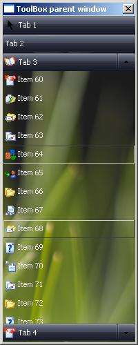
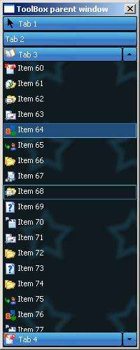
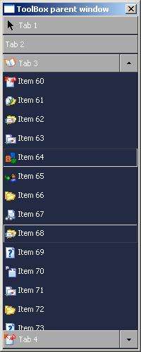
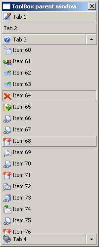
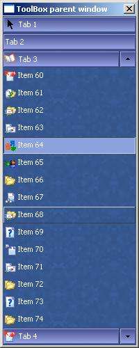
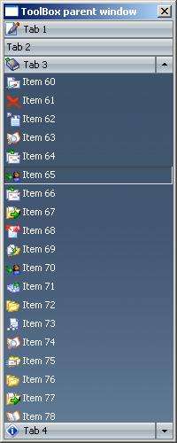
wxToolBox Screenshots
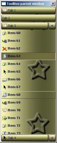
Creating and populating wxToolBox with tabs and items
Operating with tabs and items
wxToolBox Backgrounds
Working with skins
Styles
Event Handling
Associating child windows
Examples and Documentation
Supported platforms
License
How To Order
Developers
wxToolBox homepage and other links
| 
| 
| 
|
| 
| 
| 
|
// Necessary header file
#include <wx/wxToolBox/wxToolBox.h>

m_ToolBox = new wxToolBox(this, // parent window
        ID_TOOL_BOX,    // window ID
        wxDefaultPosition,      // position
        wxSize(150,400),        // size
        wxNO_BORDER     // style
        );
wxToolBox is usually populated with tabs and items like this:
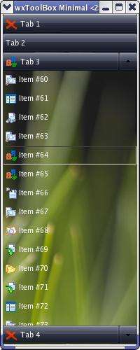
wxToolBox * m_ToolBox;
...
// We have to create tabs first...
...
wxToolBoxTab * tab1 = new wxToolBoxTab(wxT("Tab 1"));
wxToolBoxTab * tab2 = new wxToolBoxTab(wxT("Tab 2"));
wxToolBoxTab * tab3 = new wxToolBoxTab(wxT("Tab 3"));
wxToolBoxTab * tab4 = new wxToolBoxTab(wxT("Tab 4"));

// Then we have to specify image indexes for our tabs (optional)

tab1->SetImageIndex(rand()%m_ToolBox->GetTabImageList().Count());
tab3->SetImageIndex(rand()%m_ToolBox->GetTabImageList().Count());
tab4->SetImageIndex(rand()%m_ToolBox->GetTabImageList().Count());

// Then we add tabs to our component

m_ToolBox->AddTab(tab1);
m_ToolBox->AddTab(tab2);
m_ToolBox->AddTab(tab3);
m_ToolBox->AddTab(tab4);

// After the tabs have been added, we can add items

wxToolBoxItem item1("Item1", 0);

for(int i = 0; i < 120; i++)
{
        // So, we can set item's caption...

        item1.SetCaption(wxString::Format(_("Item %i"), i));

        if(m_ToolBox->GetItemImageList().Count())
        {
                // ... and image index

                item1.SetImageIndex(rand()%m_ToolBox->GetItemImageList().Count());
        }

        // Then we can add item to our tab
        if(i < 30)
        {
                tab1->AddItem(item1);
        }
        else if(i >= 30 && i < 60)
        {
                tab2->AddItem(item1);
        }
        else if(i >= 60 && i < 90)
        {
                tab3->AddItem(item1);
        }
        else
        {
                tab4->AddItem(item1);
        }
}
// This example shows hows how to create new tab and how to add this tab to wxToolBox component
wxToolBoxTab * tab = new wxToolBoxTab(tab_name_text_ctrl->GetValue(), tab_icon_spin_ctrl->GetValue());
m_ToolBox->AddTab(tab);
...
// This example shows how to add items to the tab with specified index
wxToolBoxTab * tab = m_ToolBox->GetTab(item_tab_spin_ctrl->GetValue());
if(!tab) return;
wxToolBoxItem item(item_name_text_ctrl->GetValue(), item_icon_spin_ctrl->GetValue());
tab->AddItem(item);
wxToolBoxTab * tab;
...
// Here we display editor which allows to rename item with specified index on toolbox tab
m_ToolBox->RenameItem((*tab)[index]);
...
// Here we display editor which allows to rename specified tab
m_ToolBox->RenameItem(tab);
wxToolBox * m_ToolBox;

wxToolBoxItem * item = (*tab)[index];
item->SetCaption(_("Some Item"));
item->SetSelected(true);
item->SetToolTip(_("New ToolTip"));
item->SetDeletable(false);
item->SetMovable(true);

wxToolBoxTab * tab = m_ToolBox->GetTab(m_ToolBox->GetTabCount()-1);
if(tab)
{
        tab->SetSelected(true);
        tab->SwapItems(0, tab->GetItemCount()-1);
        if(!tab->GetItemCount())
        {
                tab->SetEnabled(false);
        }
        tab->SetImageIndex(2);
}

// Here we set new height of toolbox items and height of free space between items
m_ToolBox->SetItemHeight(23);
m_ToolBox->SetItemSpacing(2);
// Here we set new height of toolbox tabs and height of free space between tabs
m_ToolBox->SetTabHeight(26);
m_ToolBox->SetTabSpacing(0);
wxToolBox * m_ToolBox;
// Load structure from file
m_ToolBox->LoadStructrue(wxT("my_file_with_structure.xml"));
// Save structure to file
m_ToolBox->SaveStructrue(wxT("my_file_with_structure.xml"));
wxToolBox::m_TabBackground - set of background bitmaps for painting toolbox tabs. You can use wxToolBox::GetTabBackground method to access it.
wxToolBox::m_ItemBackground - set of background bitmaps for painting toolbox items You can use wxToolBox::GetItemBackground method to access it.
wxToolBox::m_ButtonBackground - set of background bitmaps for painting toolbox buttons You can use wxToolBox::GetButtonBackground method to access it.
Each of this 3 sets is an object of wxToolObjectBackground class and each such object also contains 3 sets of bitmaps:
Each of previous 3 sets of bitmaps contains 3 bitmaps:
Now let's see how to set background bitmaps manually
wxToolBox * m_ToolBox;
wxToolBoxBitmapSet normal(wxT("./res/TAB_Skin_Left.jpg"),
                        wxT("./res/TAB_Skin_Middle.jpg"),
                        wxT("./res/TAB_Skin_Right.jpg"));
wxToolBoxBitmapSet hover(wxT("./res/TAB_Skin_Left_Hov.jpg"),
                        wxT("./res/TAB_Skin_Middle_Hov.jpg"),
                        wxT("./res/TAB_Skin_Right_Hov.jpg"));
wxToolBoxBitmapSet selected(wxT("./res/TAB_Skin_Left_Sel.jpg"),
                        wxT("./res/TAB_Skin_Middle_Sel.jpg"),
                        wxT("./res/TAB_Skin_Right_Sel.jpg"));
m_ToolBox->SetTabBackground(normal, hover, selected);
m_ToolBox->SetUseTabBackground(true);
m_ToolBox->SetButtonBackground(normal, hover, selected);
m_ToolBox->SetUseButtonBackground(true);
If tool object's width is bigger that summary width of left, middle and right part of its skin then middle bitmap will be tiled
Here is an example of skin file
<?xml version="1.0" encoding="utf-8"?>
<wxToolBoxSkin>
  <Style StyleValue="0"/>
  <BackgroundColour Red="35" Green="42" Blue="68"/>
  <BorderHighlightColour Red="212" Green="208" Blue="200"/>
  <BorderShadowColour Red="64" Green="64" Blue="64"/>
  <Background Path="Background.png"/>
  <TabIcons Path="ItemIcons.png" ImageWidth="16" ImageHeight="16"/>
  <ItemIcons Path="ItemIcons.png" ImageWidth="16" ImageHeight="16"/>
  <Flags ItemsTransparent="1" SelectedItemTransparent="1" UseBackground="1"
        UseStdArrows="1" SelectNewTab="1" PreDrawBackgrounds="0" ShowSelectionAlways="0"/>
  <Buttons>
    <ButtonHoverColour Red="212" Green="208" Blue="200"/>
    <ButtonNormalColour Red="170" Green="170" Blue="170"/>
    <ButtonSelectedColour Red="212" Green="208" Blue="200"/>
    <Flags UseButtonBackground="1"/>
    <NormalBackground Left="TAB_Skin_Left.PNG" Middle="TAB_Skin_Middle.PNG" Right="TAB_Skin_Right.PNG"/>
    <HoverBackground Left="TAB_Skin_Left_Hov.PNG" Middle="TAB_Skin_Middle_Hov.PNG" Right="TAB_Skin_Right_Hov.PNG"/>
    <SelectedBackground Left="TAB_Skin_Left_Sel.PNG" Middle="TAB_Skin_Middle_Sel.PNG" Right="TAB_Skin_Right_Sel.PNG"/>
  </Buttons>
  <Tabs>
    <TabHoverColour Red="212" Green="208" Blue="200"/>
    <TabNormalColour Red="170" Green="170" Blue="170"/>
    <TabSelectedColour Red="236" Green="233" Blue="216"/>
    <TabTextColour Red="255" Green="255" Blue="255"/>
    <Flags UseTabBackground="1"/>
    <Sizes TabHeight="26" TabSpacing="1"/>
    <NormalBackground Left="TAB_Skin_Left.PNG" Middle="TAB_Skin_Middle.PNG" Right="TAB_Skin_Right.PNG"/>
    <HoverBackground Left="TAB_Skin_Left_Hov.PNG" Middle="TAB_Skin_Middle_Hov.PNG" Right="TAB_Skin_Right_Hov.PNG"/>
    <SelectedBackground Left="TAB_Skin_Left_Sel.PNG" Middle="TAB_Skin_Middle_Sel.PNG" Right="TAB_Skin_Right_Sel.PNG"/>
    <TabNormalFont DefaultEncoding="-1" FaceName="MS Shell Dlg 2" Family="74" PointSize="8" Style="90" Underlined="0" Weight="90"/>
    <TabHoverFont DefaultEncoding="-1" FaceName="MS Shell Dlg 2" Family="74" PointSize="8" Style="90" Underlined="0" Weight="92"/>
    <TabSelectedFont DefaultEncoding="-1" FaceName="MS Shell Dlg 2" Family="74" PointSize="8" Style="90" Underlined="0" Weight="90"/>
  </Tabs>
  <Items>
    <ItemHoverColour Red="79" Green="95" Blue="121"/>
    <ItemNormalColour Red="35" Green="42" Blue="68"/>
    <ItemSelectedColour Red="146" Green="151" Blue="164"/>
    <ItemTextColour Red="255" Green="255" Blue="255"/>
    <Flags UseItemNormalBackground="0" UseItemHoverBackground="0" UseItemSelectedBackground="0"/>
    <Sizes ItemHeight="26" ItemSpacing="1"/>
    <NormalBackground Left="" Middle="" Right=""/>
    <HoverBackground Left="Item_Skin_Left_Hov.PNG" Middle="Item_Skin_Middle_Hov.PNG" Right="Item_Skin_Right_Hov.PNG"/>
    <SelectedBackground Left="Item_Skin_Left_Sel.PNG" Middle="Item_Skin_Middle_Sel.PNG" Right="Item_Skin_Right_Sel.PNG"/>
    <ItemNormalFont DefaultEncoding="-1" FaceName="MS Shell Dlg 2" Family="74" PointSize="8" Style="90" Underlined="0" Weight="90"/>
    <ItemHoverFont DefaultEncoding="-1" FaceName="MS Shell Dlg 2" Family="74" PointSize="8" Style="90" Underlined="0" Weight="90"/>
    <ItemSelectedFont DefaultEncoding="-1" FaceName="MS Shell Dlg 2" Family="74" PointSize="8" Style="90" Underlined="0" Weight="90"/>
  </Items>
</wxToolBoxSkin>
You can separately enable or disable skinning of toolbox tabs, toolbox items or toolbox buttons:
wxToolBox * m_ToolBox;
...

m_ToolBox->SetUseTabBackground(true);
m_ToolBox->SetUseButtonBackground(false);
m_ToolBox->SetUseItemBackground(false);
...
// If you want to enable or disable skinning of all tool objects, you can use wxToolBox::UseSkin method
...

m_ToolBox->UseSkin(true);
wxToolBox component allows to specify background colours, foreground colours and fonts for all tool objects.
All colours and fonts separated to 3 categories: Normal, Hover and Selected.
Normal category is used for painting tool objects with normal state
Hover category is used for painting tool objects when user moves mouse pointer over them
Selected category is used for painting tool objects when user presses mouse button on them
Here is an example of customizing colours and fonts:
wxToolBox * m_ToolBox;
...
m_ToolBox->SetBackgroundColour(wxColour(35, 42, 68));

m_ToolBox->SetItemNormalColour(wxColour(35, 42, 68));
m_ToolBox->SetItemHoverColour(wxColour(79, 95, 121));
m_ToolBox->SetItemSelectedColour(wxColour(146, 151, 164));
m_ToolBox->SetTabNormalColour(wxColour(170, 170, 170));
m_ToolBox->SetTabSelectedColour(wxColour(236, 233, 216));
m_ToolBox->SetButtonNormalColour(wxColour(170, 170, 170));

m_ToolBox->SetItemTextColour(*wxWHITE);

wxFont font(10, wxFONTFAMILY_DEFAULT, wxFONTSTYLE_NORMAL, wxFONTWEIGHT_NORMAL, false, wxT("Courier New"));
m_ToolBox->SetItemNormalFont(font);
m_ToolBox->SetItemHoverFont(font);
font.SetWeight(wxFONTWEIGHT_BOLD);
m_ToolBox->SetItemHoverFont(font);
One more important thing is item transparency. wxToolBox allows to specify transparency for selected state of item separately:
wxToolBox * m_ToolBox;
...

m_ToolBox->SetItemsTransparent(true);
m_ToolBox->SetSelectedItemTransparent(false);
Also wxToolBox component allows to specify colours for painting bevels of tool objects:
// Colour for painting highlighted part of bevels
m_ToolBox->SetBorderHighlightColour(wxColour(192, 192, 192));
// Colour for painting shadowed part of bevels
m_ToolBox->SetBorderShadowColour(wxColour(100, 100, 100));
There are several skins available for downloading:
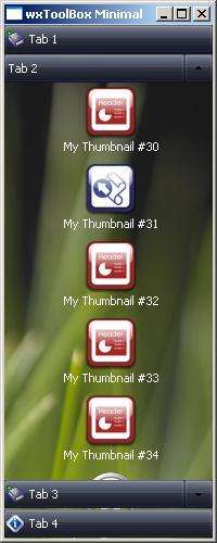
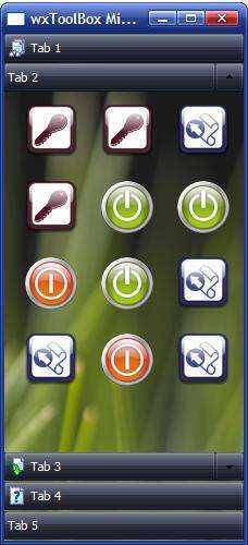
Thumbnails style allows you to incorporate a side bar control into your applications. The side bar is one of the brightest parts of Outlook's interface. It is elegant, convenient, and intuitive: often unnoticeable yet taking the major role in the interface navigation.
|
| 
|
|
It is very simple to switch between ToolBox styles:
wxToolBox * m_ToolBox;
...
m_ToolBox->SetItemHeight(70);
m_ToolBox->SetItemImageHeight(48);
m_ToolBox->SetItemImageWidth(48);
m_ToolBox->SetStyle(wxTB_TAB_THUMBNAILS);
BEGIN_EVENT_TABLE(ToolBoxHostFrame, wxFrame)
...
EVT_TB_TAB_SELECTED(10001, ToolBoxHostFrame::OnToolBoxTabSelected)
...
EVT_TB_ITEM_ADDED(10001, ToolBoxHostFrame::OnToolBoxItemAdded)
EVT_TB_ITEM_SELECTED(10001, ToolBoxHostFrame::OnToolBoxItemSelected)
...
END_EVENT_TABLE()

...

void ToolBoxHostFrame::OnToolBoxTabSelected(wxToolBoxEvent & event)
{
        wxToolBoxTab * tab = event.GetTab();
        if(tab)
        {
                // Do something...
        }
        else
        {
                // Error occured...
        }
}

void ToolBoxHostFrame::OnToolBoxItemAdded(wxToolBoxEvent & event)
{
        wxToolBoxItem * item = event.GetItem();
        if(item)
        {
                // Do something...
        }
        else
        {
                // Error occured...
        }
}

void ToolBoxHostFrame::OnToolBoxItemSelected(wxToolBoxEvent & event)
{
        wxToolBoxItem * item = event.GetItem();
        if(item)
        {
                wxToolBoxTab * tab = item->GetParentTab();
                if(tab)
                {
                        // Do something with tab...
                }
                // Do something...
        }
        else
        {
                // Error occured...
        }
}
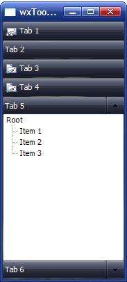
wxToolBoxTab * tab5 = new wxToolBoxTab(wxT("Tab 5"));
wxTreeCtrl * treeCtrl = new wxTreeCtrl(m_ToolBox, wxID_ANY,
        wxDefaultPosition, wxDefaultSize, wxNO_BORDER);
wxTreeItemId root = treeCtrl->AddRoot(_("Root"));
treeCtrl->AppendItem(root, _("Item 1"));
treeCtrl->AppendItem(root, _("Item 2"));
treeCtrl->AppendItem(root, _("Item 3"));
treeCtrl->Expand(root);
tab5->SetChildWindow(treeCtrl);
...
m_ToolBox->AddTab(tab5);
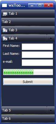
wxToolBox can contain not only simple controls e.g. wxListBox or wxTreeCtrl. You can also place containers such as wxPanel inside wxToolBox tab
wxToolBoxTab * tab4 = new wxToolBoxTab(wxT("Tab 4"));
tab4->SetImageIndex(rand()%m_ToolBox->GetTabImageList().Count());

wxPanel * tab4panel = new wxPanel(m_ToolBox, wxID_ANY,
        wxDefaultPosition, wxDefaultSize, wxNO_BORDER);
wxBoxSizer *tab4panel_sizer = new wxBoxSizer(wxVERTICAL);
tab4panel->SetSizer(tab4panel_sizer);

wxFlexGridSizer * flexgrid_sizer = new wxFlexGridSizer(2, 2, 5, 5);

wxStaticText * fn_label = new wxStaticText(tab4panel, wxID_ANY, _("First Name:"));
wxStaticText * ln_label = new wxStaticText(tab4panel, wxID_ANY, _("Last Name:"));
wxStaticText * em_label = new wxStaticText(tab4panel, wxID_ANY, _("e-mail:"));

wxTextCtrl * fn_text = new wxTextCtrl(tab4panel, wxID_ANY, wxEmptyString);
wxTextCtrl * ln_text = new wxTextCtrl(tab4panel, wxID_ANY, wxEmptyString);
wxTextCtrl * em_text = new wxTextCtrl(tab4panel, wxID_ANY, wxEmptyString);

fn_label->SetForegroundColour(*wxWHITE);
ln_label->SetForegroundColour(*wxWHITE);
em_label->SetForegroundColour(*wxWHITE);

flexgrid_sizer->AddGrowableCol(1, 1);
flexgrid_sizer->Add(fn_label, 0, wxALIGN_LEFT);
flexgrid_sizer->Add(fn_text, 0, wxGROW);
flexgrid_sizer->Add(ln_label, 0, wxALIGN_LEFT);
flexgrid_sizer->Add(ln_text, 0, wxGROW);
flexgrid_sizer->Add(em_label, 0, wxALIGN_LEFT);
flexgrid_sizer->Add(em_text, 0, wxGROW);

m_tab4gauge = new wxGauge(tab4panel, wxID_ANY, 100,
        wxDefaultPosition, wxSize(-1,20),
        wxHORIZONTAL|wxGA_SMOOTH|wxNO_BORDER);

long submit_id = wxNewId();
wxButton * submit_btn = new wxButton(tab4panel, submit_id, _("Submit"));
Connect(submit_id, wxEVT_COMMAND_BUTTON_CLICKED,
                wxObjectEventFunction(&wxToolBoxMinimalTestFrame::OnSubmit));

tab4panel_sizer->Add(flexgrid_sizer, 0, wxGROW|wxALL, 5);
tab4panel_sizer->Add(m_tab4gauge, 0, wxGROW|wxALL, 5);
tab4panel_sizer->Add(submit_btn, 0, wxGROW|wxALL, 5);

tab4->SetChildWindow(tab4panel);
| 
|
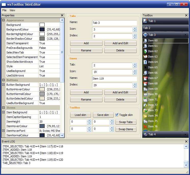
ToolBox Skin Editor - utility for creating and editing wxToolBox skins. It demonstrates principles of usage of wxToolBox component.
ToolBox SkinEditor executable for MS Windows
ToolBox SkinEditor source (MSVC 7.1 project) without component's source code
wxDev-CPP Demo Project
MinGWStudio Demo Project for Linux
wxToolBox documentation
| wxMSW ScreenShot | wxGTK ScreenShot |
|
| 
|
 1.5.2
1.5.2